
Bright Lights and the Power of Yellow
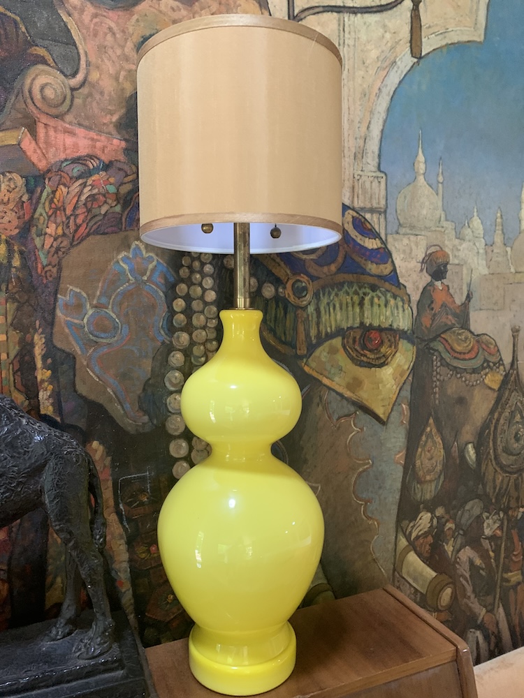
A matched pair of lamps in bright yellow glass standing three feet tall combines the history of glass, the history of the color yellow, and the 20th century history of stylish designer lighting. An object contains worlds!
The lamps were manufactured by two entrepreneurial Pacific Coast brothers, Morris and Elliot Markoff, both born in the last years of the 19th century. Their company, Marbro (a combination of their last name and “brother”), was based at the corner of Main and West 1st Street in Los Angeles and lasted till 1990. The brothers were known for designs which incorporated the best materials for their lamp bases: in this case, Venetian Murano glass born in Italy, but they also sourced alabaster from Italy, Chinese and Japanese porcelain vases, German and French crystal bases, and brass from India. Their lamps were considered high-end, produced in a huge variety of styles and period designs. They employed a team of seamstresses to handcraft shades as well. A pair of these lamps today will set you back $2,000 to $3,000.
Yes, the lamps are bright yellow, and knowing the interior design trends in this color helps us to date the lamps. The Op Art inspired shape, and the deep yellow-to-greenish-undertone neon, points to the early 1960s. There are several distinct eras that were not “afraid” of using bright yellow for interior accents: one, the birth years of the lamps, from the mid-1950s to the mid-1960s, when designers used that bright neon yellow color for decorative objects, with fabrics in geometric patterns, and paint colors.
Working backwards in time, the period post-WWII in both England and the U.S. saw decorative accents in bright yellows: some say the optimism brought by the ending of the war created a desire for the “spirit-lifting” color. The yellow decorative objects produced for the mass market in the 1940s were not subtle in form, were not “high-end,” and were affordable to the working or middle class. In fact, Lawrence Levine’s seminal book Highbrow/Lowbrow: The Emergence of Cultural Hierarchy has a section on such bright (useless; lowbrow) ornamental objects.
In the 19th century, many types of glass and ceramic products, including Victorian oil lamps, were produced in a bright yellow tone. From the most subtle to the most vivid tones of yellow in glass, amber glass was an old color and one that used metallic silver for pigmentation. This color was used on 17th–19th century stained glass windows.
A departure from that subtle touch of yellow, we see the 1830s development of Uranium glass, almost a neon yellow with undertones of green, made from a pigment of uranium oxide, a glass that will fluoresce as bright neon green under UV light. Many people suspect radiation from this color of glass. In fact, the most pursued article at the Museum of Radiation and Radioactivity deals with the potency of this color glass. Next in the line of vivid yellow glass is Vaseline glass, made popular in the Depression years, not a true yellow but a green-yellow, which also fluoresces neon green under black light.
Developments in glass technology around yellow-toned glass in the late 19th and early 20th century included both opaque and clear glass, such as cased glass (created in two separate blown-glass layers in two tones – one color, usually white, as the underlayer); Burmese glass, a matte yellow glass with an underlayer of a peach-colored tone; yellow milk glass, tempered by a white-pigmented glass; and all types of vessels in yellow tones flashed with a metallic hue, prizes at early 20th century fairs called “Carnival Glass.”
Since I just painted my kitchen in my 1962 Santa Barbara condo a bright yellow, I was interested to discover that I am in “style.” The design world is experiencing a shift from cooler tones such as blues, greys, and blue-blacks to yellow-tinted neutrals, all the way to my color, which is Citric Yellow.
Thus, yellow as a color in the history of design is a recurring favorite; some tones suggest both tradition and nobility, such as gold yellows. Likewise, the subtle cream yellows used upon the walls at Sir John Soane’s Museum, established by the great Regency architect Sir John Soane in London, 1813, suggest highbrow class. Contrast this with the yellow loved by Mrs. Flade in her collection of garish bath ceramic figurines. Take Mrs. Flade’s split-level house down the road in Deerfield where I grew up: her cute, bright yellow ceramic fish on the bathroom walls, her yellow ceramic soap dish, and handmade yellow crochet toilet paper cover. Long live yellow!
You might also be interested in...




You must be logged in to post a comment.