
Graphic Design Through the 20th Century

A gift that the universe gives to the right person is rare. Take Emma Howard, a talented local designer (I have permission to use her name). Emma – owner of Studio 3 Hand Rendered Textiles and Surface Designs (her office is on hiatus today) – was visiting her son when she noticed a pile of trash in front of a vacant house in his neighborhood. Against the heap of old furnishings was a designer’s dream: a vintage graphic design work, rendered by hand with the old-fashioned tools of water-based gouache, a paint brush, and a ruling pen, supported on a heavy paper board. The uneven edges of the design indicated to Emma that this find was a hand-done work; there would be no need for an artist to make perfectly finished edges, because this template would have been used as a basis for a side-by-side fabric design for a woven or printed fabric.
Emma asked my opinion on the age of the piece, which was without its frame and glazing on the street that day, but was in remarkable condition. There are two ways to research the date of creation; one is to research the technical developments in graphic design – more to the point, the history of 3-D design from the pen to Computer-Aided Design (CAD) for a PC.
The other way to research this work’s era is to compare it to other graphic designs in selected STYLES (a stylistic/artistic analysis). I researched a few select eras: one, the 1920s-1930s when graphic design was moving from Art Nouveau to Art Deco, and the other era, 1950s-1960s, for graphic design influenced by Op Art.
Firstly let us take the technological approach. When did 2- and 3-D software become predominant over hand-rendered graphic design? An artist in 2025 may, of course, work without software to create a graphic design by hand – but the higher likelihood is of a hand-rendered work having been created prior to the appearance of such software. It was not until the 1980s that computer assisted 3-D design was thought of as becoming a future industry standard. By the early 1990s, affordable personal computers helped usher in this new period of software-assisted design.
The first 2-D software was created in 1963 and was called “Sketchpad.” The first affordable PC was developed in 1981 by IBM. So the likelihood is that the design that Emma found could be of either the Art Deco period OR the Op Art period; both eras would have graphic designers who predominantly worked by hand.
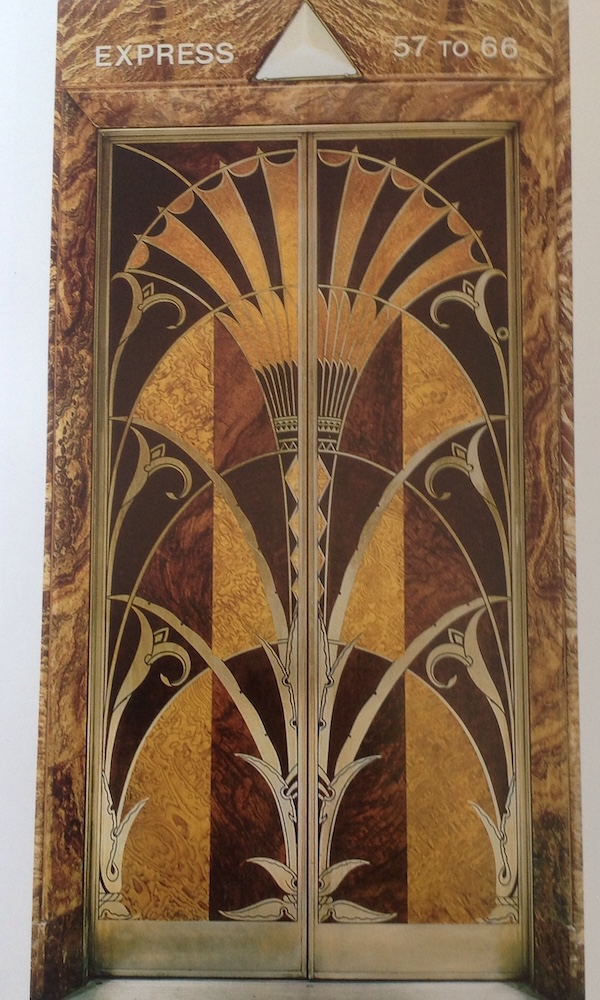
The characteristics of Art Deco design – prevalent for a few years in the U.S. between 1920s-30s – are bold, graphic shapes, strong lines, unusually rich colors with black or old metallic accents, glamour, luxury, zigzags, triangles, chevrons, streamlined patterns, clear order, and symmetry. These are evocative words for this period.
What characterizes Op (Optical) Art design, popular from mid-1950s to the mid-1960s, are primary or slightly off primary (neon) vivid, eye-popping colors, repeating abstract patterns, clean geometric shapes and layouts, abstract repetitions. Which of these two stylistic eras best reflect the treasure that Emma found?
I compared Emma’s creation to my very favorite Deco design, the gorgeously rich elevator doors of the Chrysler building’s lobby in Manhattan (my grandfather was an elevator engineer and had something to do with these elevators). The doors were designed by William Van Alen in 1927-1930, and they are not PURE deco, as he borrowed from the previous stylistic era (Nouveau) as we can see by a hint of an exotic organic curvilinear line. The colors are rich deep tones, exotic wood and gold leafing.
The color scheme of Emma’s treasure leads me to believe that the stylistic period is likely NOT Deco: yellows and sky blues were not typical. AND the paperboard is in unusually good shape for a 100-year-old board. It makes me lean towards the 1960s…
Design for fabrics has always been important in the U.S. Amazingly, we see the cult of George Washington in 18th century textiles. His image on fabrics is ubiquitous, printed from copper plate or woven, with early federalized images of the eagle. One fabric shows “The Apotheosis of Ben Franklin,” a tribute to Franklin upon his death in 1790, with George Washington leading his funeral cortege which is drawn by leopards. Franklin floats over the scene in a beaver fur cap. The Bauhaus (1919-1933) offered a degree in textile design, and geometric woven wool wall hangings produced in this era are artworks. In the 1950s, Frank Lloyd Wright worked with the fabric company Schumacher to design a line of textiles based on his architectural vocabulary. These became iconic and highbrow purchases.
I would place a value of $2,500 on Emma’s work of graphic art.
You might also be interested in...



You must be logged in to post a comment.